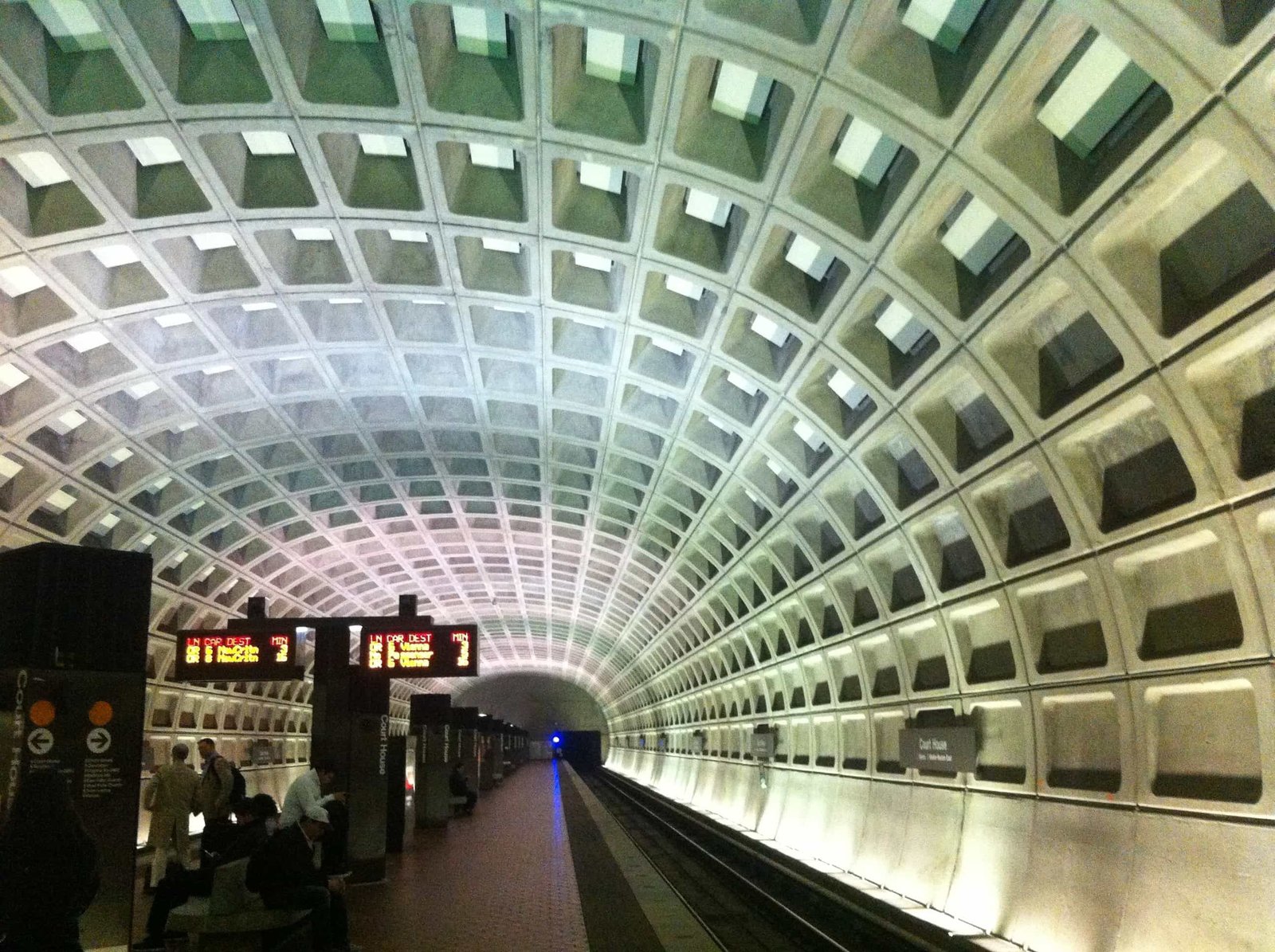
I was recently in Washington, D.C. working on a book project…which is going to be incredible, by the way, but more on that some other time. On a windy and drizzly day between meetings I had a little time to explore and I was immediately struck by the immensity of everything. From the moment you step into the Metro tunnel to your first stroll down the National Mall, you can’t help but be impressed and a little intimidated.
Of course, this is no accident and it’s a great example of how form follows function in design. Disciplines from architecture and landscape to environmental and graphic design all rely on this principle. Take the Metro tunnel for instance—it looks amazing. The coffered ceilings create a pattern and a sense of scale that wouldn’t be the same without it. It’s incredibly beautiful, almost mesmerizing. But it’s not just for looks. It provides maximum strength at a minimum weight and material. Architects throughout history have used the same tactic to create strong domes that also have a somewhat ethereal quality, lifting the viewers eyes and, presumably, their spirits.
The same principle goes for that walk down the Mall. The design and placement of the monuments is not purely a visual play. The designers have used the space, scale and a visual language of classical architecture to conjure up specific feelings and references. Of course it looks visually stunning, but you are meant to feel the importance of this place…and you do. The visual effect is largely a result of the function of the space.
This all got me thinking about my role as a graphic designer. With graphic design, the same rules apply. A brochure is not just a bunch of images and text thrown on a page or two. It tells a story, a unique story, and every element has to be considered in much the same way that the architects of the National Mall considered the message they were trying to convey. A website is not just an assemblage of pages that dryly go about the business of giving information. The interaction and user experience must be carefully considered in order to make it easy to navigate as well as a delight to use and read. Usability and impactful storytelling are no accident, they must be crafted and refined. If you are using design strictly to convey a cool visual or an animated graphic on a website for the sake of having it, then you are simple missing the point. Instead, consider the power of the intended function to create solutions that delight and surprise.
I was surprised, and proud, to be walking around our nation’s capitol for the first time. It was compelling in a way that I did not think that it would be and will be an experience that will stick with me for a long time to come.